What you’ll need:
Any Kommo plan (Base, Advanced, Pro, Enterprise, or 14-day trial) for all widgets apart from the Net Promoter Score (NPS) widget. NPS widget requires the Kommo Pro plan.
Keep in mind:
Dynamic comparison statistics (green/red numbers) are available on newly created widgets 24 hours later.
Dynamic comparison statistics do not display if the Apply dashboard settings for all users is enabled.
Reverting the dashboard to its original layout is not supported.
Dashboard widgets only store and display dynamic performance statistics for a maximum of 65 days.
Dashboard widgets help you track the most important sales and communication data at a glance. They bring urgent information to one place so you can monitor team activity, pipeline progress, and message handling without digging through detailed reports.
You can customize your dashboard using three types of widgets:
Default widgets come pre-installed and ready to go as soon as you open your dashboard.
Advanced widgets offer deeper account insights and can be added to your dashboard manually whenever you need them.
Custom widgets give you full flexibility—create them directly from your Kommo filters or import custom files.
Understand dashboard widget colors
The colors of the metric numbers on your dashboard indicate where their data is sourced from and how you can interact with them:
Purple numbers: Represent standard Kommo entities (leads, contacts, companies, tasks). These metrics can be filtered by the responsible manager but do not support dashboard date filtering.
Green and red numbers: Represent events tracked in the Activity log. These metrics fully support dashboard date filtering and automatically display green or red comparison dynamics showing performance trends over time.
Default widgets
These widgets are simple, easy to read, and included in the preset dashboard. They help you stay updated on messenger-based sales, leads, and tasks.
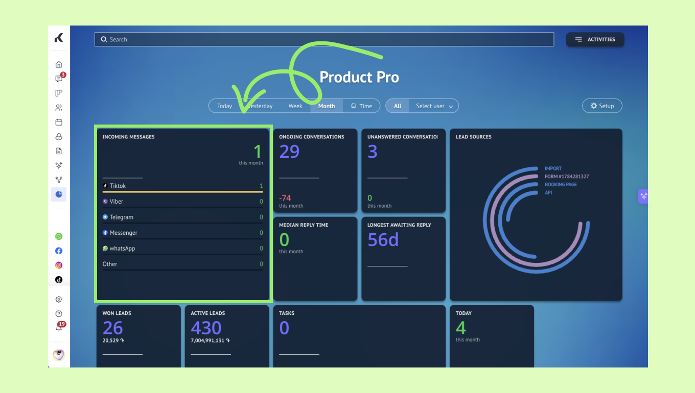
Incoming messages
This widget shows how many incoming messages your team received during the selected period. It also breaks the data down by channel, so you can see which connected sources are used most often.
Conversation widgets
These widgets help you track how well your chats are handled. They are real-time, so they show the current situation rather than data from the selected dashboard period.
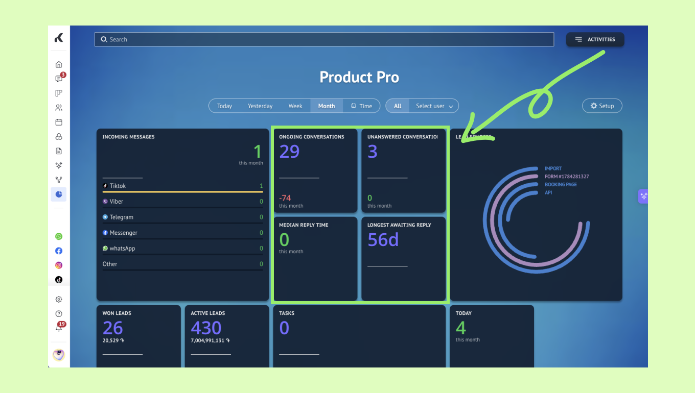
Ongoing conversations widget shows how many clients still need attention.
Unanswered conversations widget shows how many clients have not received a reply yet.
Median reply time shows the middle reply time for incoming messages.
Longest awaiting reply shows the lead that has been waiting the longest for a response.
Lead sources
This widget shows where your incoming leads come from. The source with the highest number of incoming leads is shown first, and other sources are compared against it.
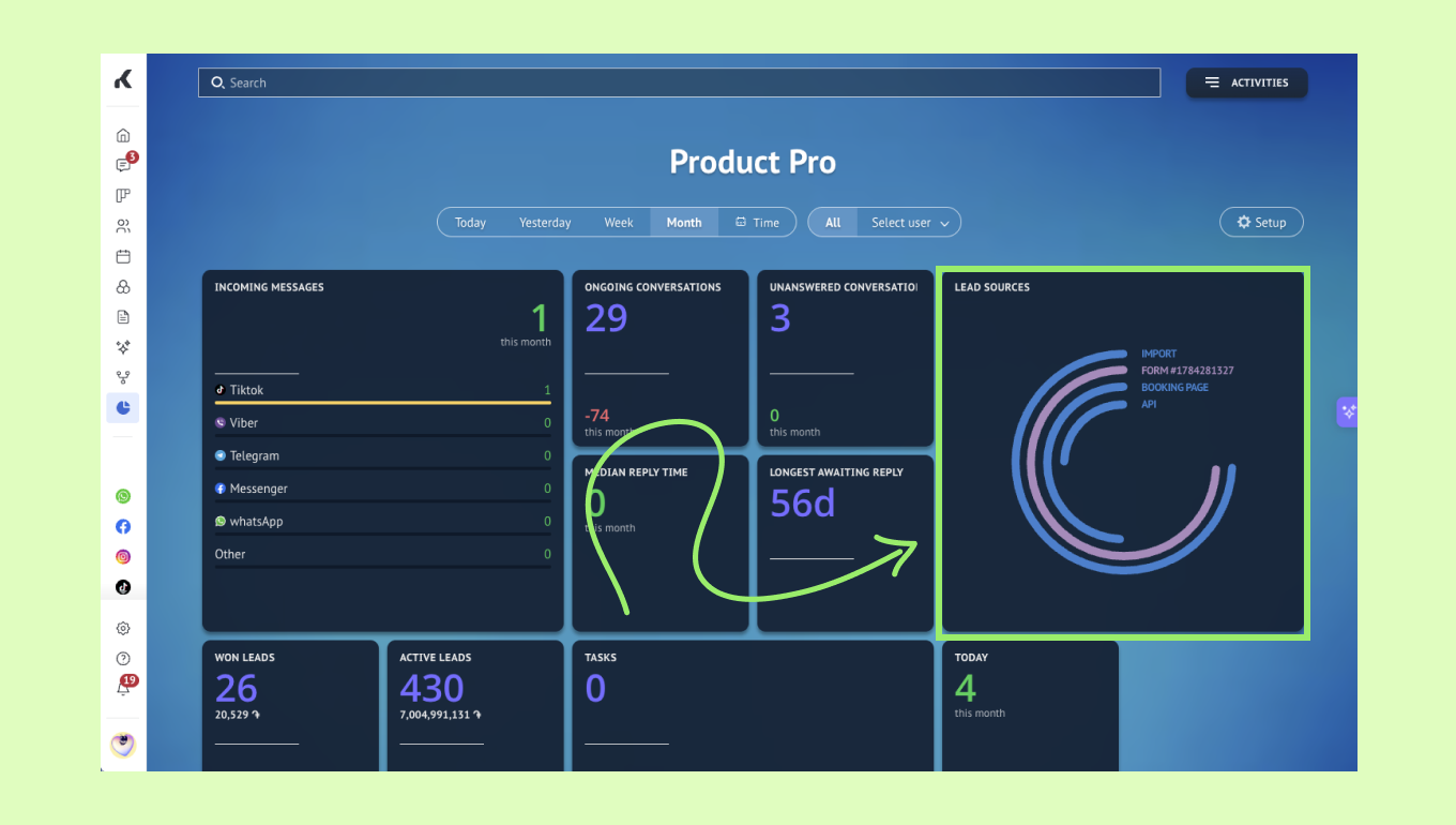
The chart depends on the lead sources connected to your account, such as chats or web forms.
Lead widgets
These widgets show the main lead activity in your account.
Note: These widgets are interactive, so you can click the number to open the related lead list.
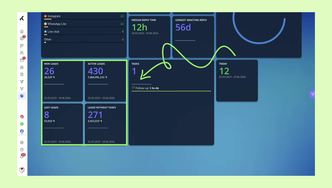
Won leads shows how many leads were moved to Won.
Active leads shows how many leads are currently in active pipeline stages.
Lost leads shows how many leads were moved to Lost.
Leads without task shows how many leads do not have a task assigned.
Important: The Leads without tasks widget displays a static total that does not change when a different dashboard time period is selected.
Tasks widget
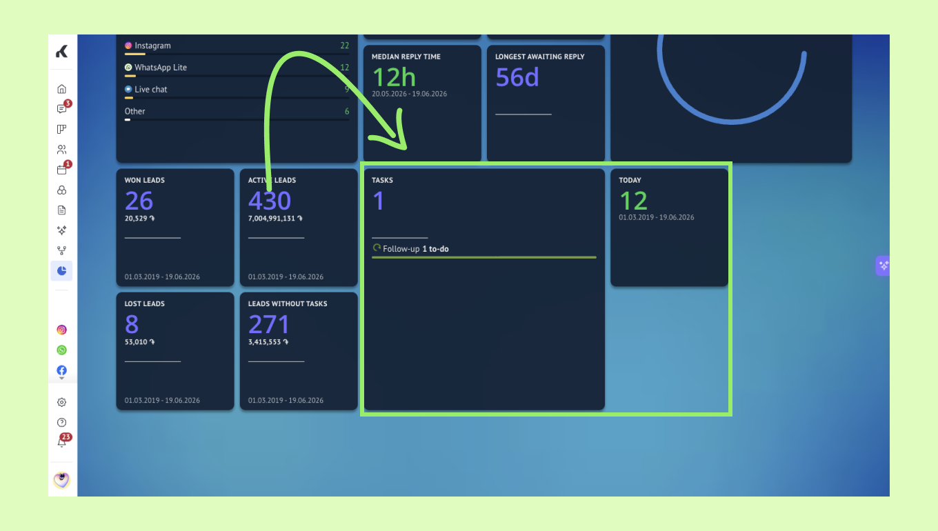
You can click the number on the widgets to open the Calendar section and review tasks in more detail.
You can also change how the widget is displayed, depending on your dashboard setup.
To learn more about the Calendar feature and how the tasks work, read our article.
Advanced widgets
Advanced widgets give you a deeper view of sales, forecasting, satisfaction, and usage.
Important: Advanced widgets are not shown on the dashboard by default. To learn how to add and configure them, check out our article.
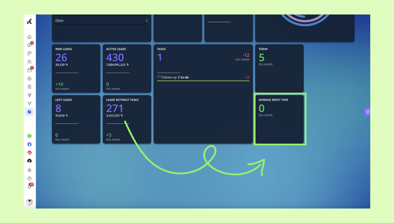
Average reply time
This widget shows how quickly leads are getting answers. It is calculated from all reply times in the selected period, so one long delay can affect the result.
Pipeline report
This widget gives a snapshot of your sales pipeline. If you have multiple pipelines, you can choose which one to display on the left-most list.
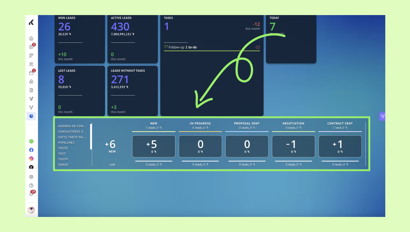
This widget shows how leads move through the pipeline, how much revenue they bring, and how many leads are won or lost. Each stage updates as leads move, so the widget always reflects the current state of the pipeline.
Goals
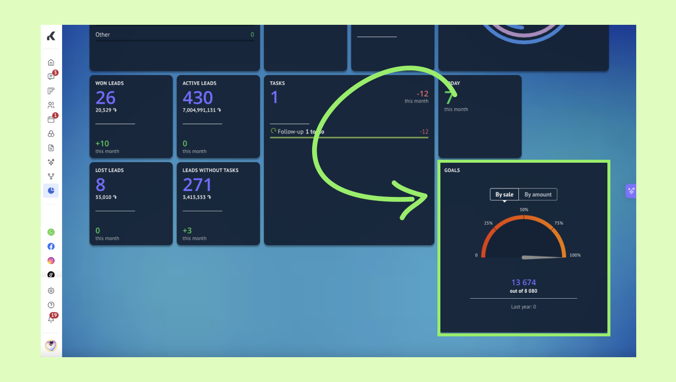
This widget helps you track progress toward sales goals. Before it appears on the dashboard, you need to set goals in Stats > Goal report > Set goals. To learn more about the Goal report, read our article.
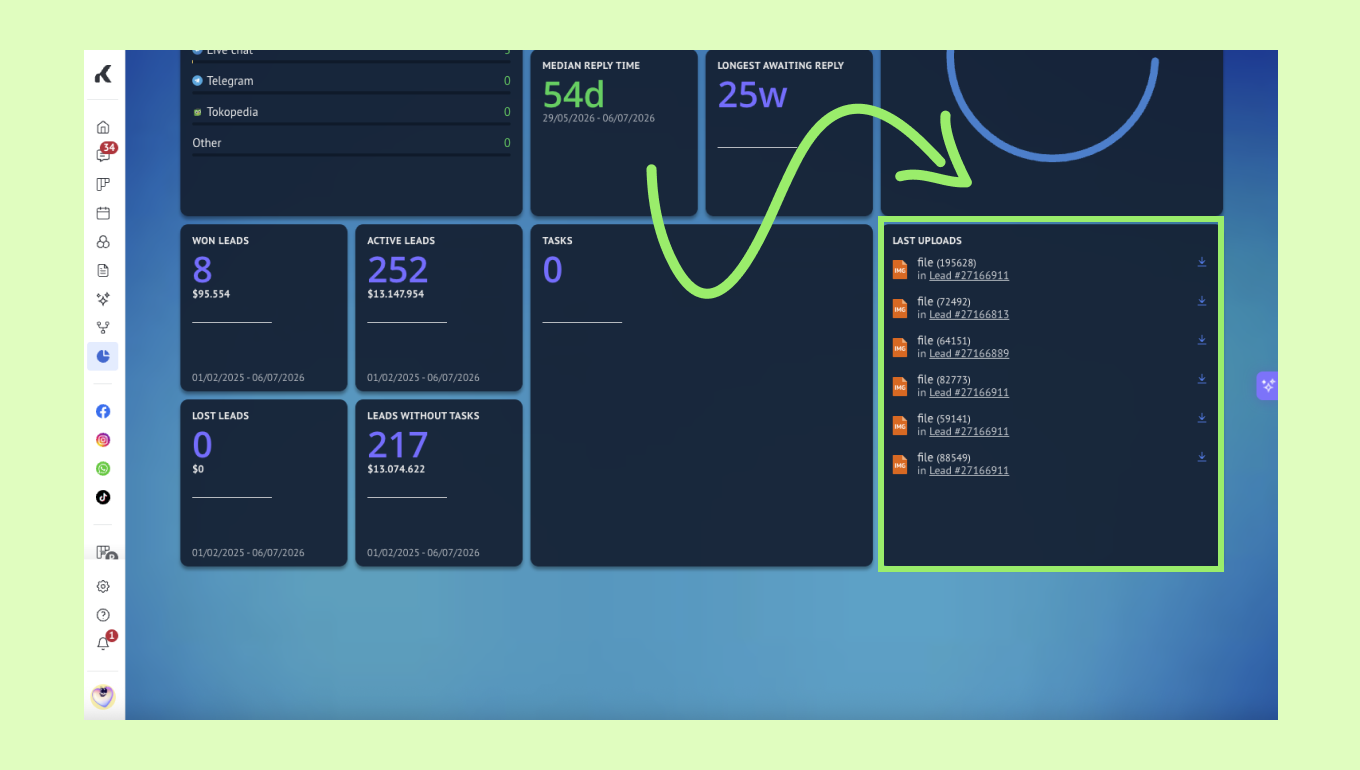
Last uploads
This widget shows the most recent files uploaded by users. Files can be attached to notes, tasks, or chat messages.
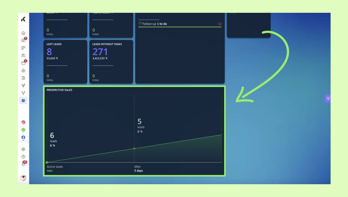
Prospective sales
This widget shows a forecast based on active leads and their total budget. It helps you estimate how many leads may be won and what value they may bring.
Net Promoter Score (NPS)
This widget shows the results of your NPS bot. After a conversation, you can send the bot to ask how likely a client is to recommend your business.
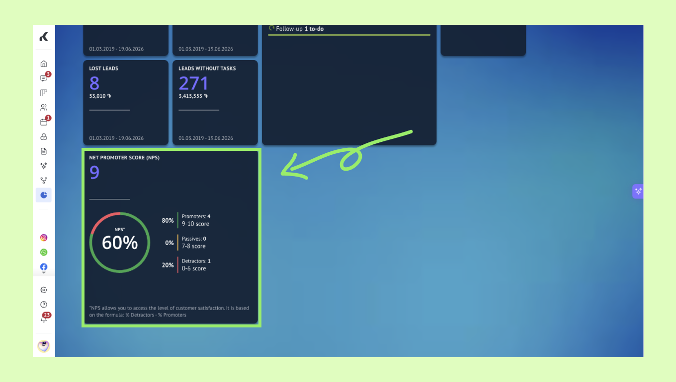
Promoters.
Passives.
Detractors.
It also shows the total number of responses and the overall satisfaction rate.
To learn more about the Net Promoter Score bot, read our article.
Important: You need an active Kommo Pro plan to use the NPS widget.
Online
This widget shows how much time users spend in Kommo during a selected period. It helps you monitor account activity and user engagement.
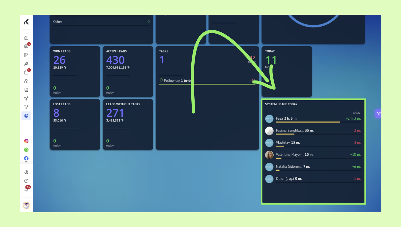
The system does not count a user as online if the window is minimized, the user switches to another webpage, another app is opened full screen, or the internet connection is lost.
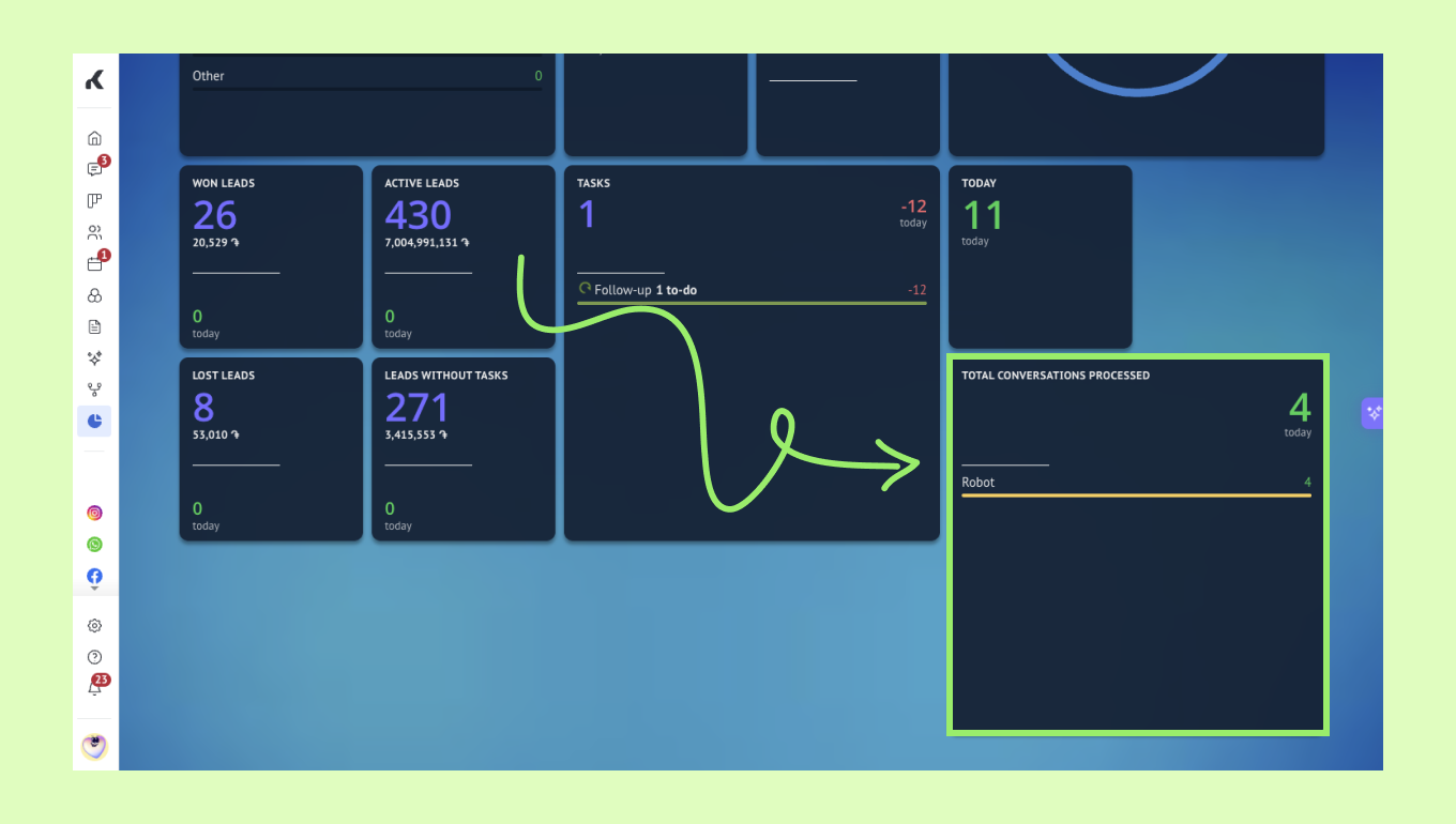
Total conversations processed
This widget shows the total number of conversations in your account and the breakdown by user. If more than one manager participates in the same conversation, each manager is counted separately.
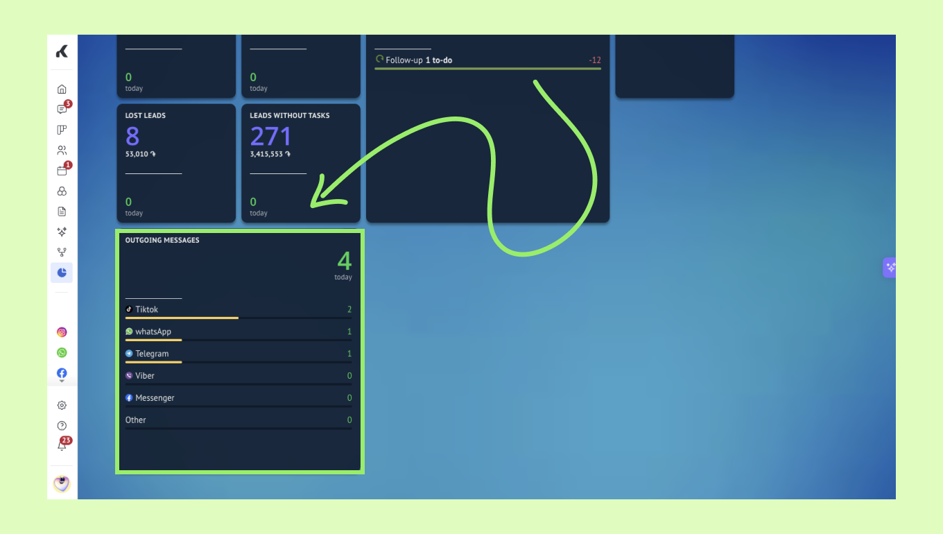
Outgoing messages
This widget shows how many messages users sent. The data is split by messenger, so you can see where outgoing activity is happening most often.
Average response time
This widget shows the average time it takes for your team to respond to client messages. It compares the selected period with the previous one and helps you spot changes in response speed.
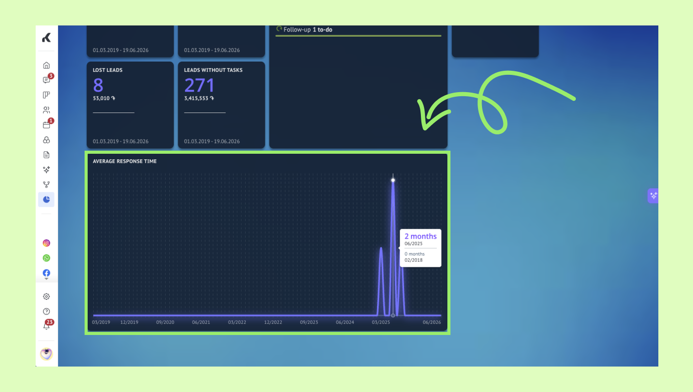
If one conversation takes much longer than the rest, it can create a visible spike in the graph.
Custom widgets
Unlike prebuilt widgets that deliver instant, standard reporting out of the box, custom widgets let you tailor your dashboard to your exact workflow. They allow you to go beyond standard metrics by embedding your own server-hosted applications or converting filtered data views—contacts, pipelines, or tasks—into dynamic visual tiles.
To set one up step-by-step, check out our guide.