What you’ll need:
Any Kommo plan: Base, Advanced, Pro, Enterprise, or a 14-day trial
Permissions to access the report data.
Keep in mind:
If there is not enough historical data, the widgets may show a Not enough data for report message instead.
Pipeline stages that currently contain no active leads are automatically hidden from the report.
Managers who are not currently assigned any active leads are automatically hidden.
The Consolidated report gives you a complete overview of your team and process performance in one place. It combines key metrics on leads, contacts, and tasks, helping you monitor pipeline health and identify trends over time.
Use cases
Get a complete sales overview — Monitor key metrics, including leads, contacts, purchases, and tasks, from a single dashboard.
Track pipeline performance — Analyze lead distribution across pipeline stages to identify bottlenecks and monitor the overall health of your sales process.
Compare team performance — Review how leads, contacts, purchases, and tasks are distributed among Kommo users to better understand workload and ownership.
Monitor sales trends — Switch between daily, weekly, and monthly views to track changes in lead activity and sales performance over time.
Support data-driven decisions — Combine pipeline, team, and client insights to evaluate performance and forecast future sales activity.
How to view the Consolidated report
To access the Consolidated report, follow these steps:
Go to the Insights section in Kommo.
Click on Consolidated report.
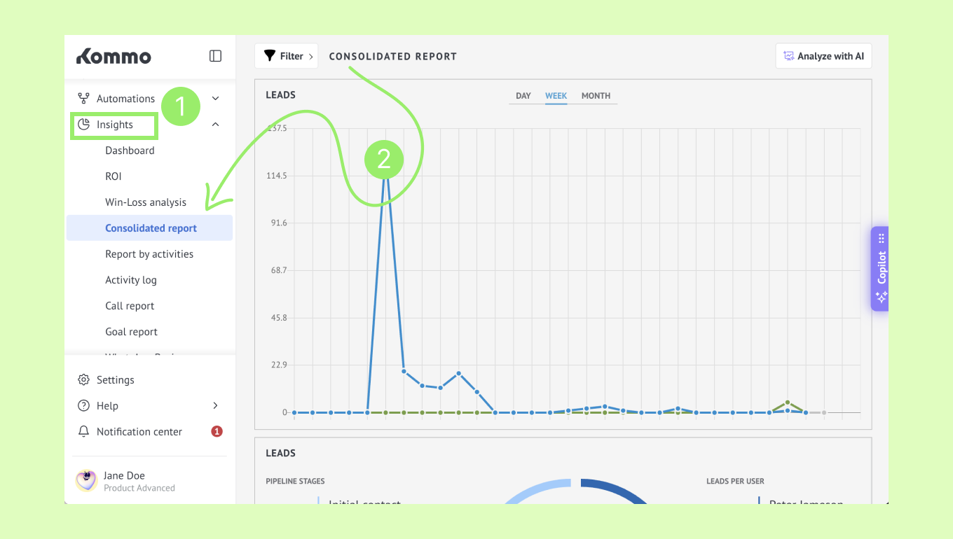
You will see several widgets that provide a high-level overview of your performance by combining lead trends, pipeline distribution, and user workload into a single dashboard. Let’s break them down.
How the Consolidated report works
Leads
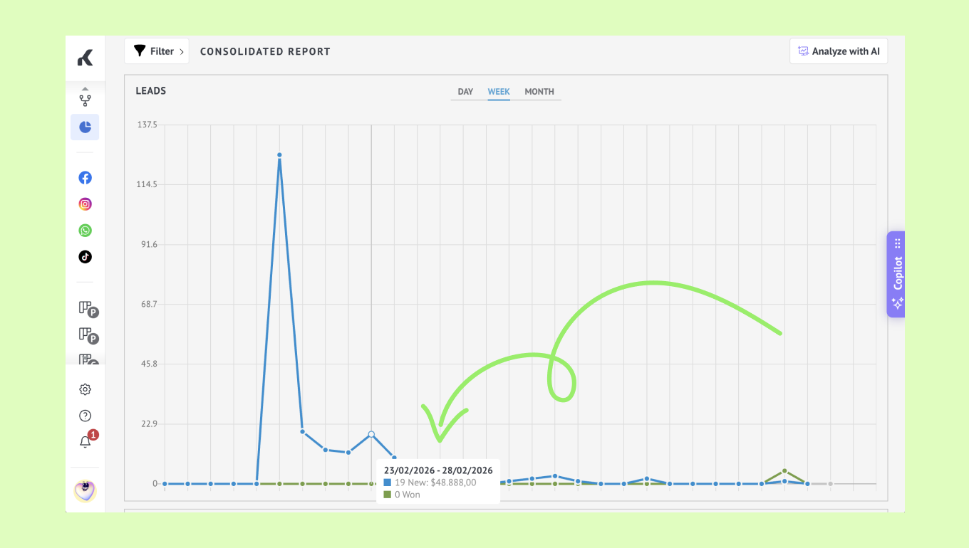
The upper graph displays lead activity over time. It compares key lead metrics, such as newly created and won leads, making it easy to identify periods of increased activity and track sales performance over time. Switch between Day, Week, and Month views to analyze trends at different time scales.
Tip: Hover over any data point to view the exact values for the selected period.
The lower chart provides an overview of your current sales pipeline. The donut chart displays the total number of leads, while the surrounding widgets break them down by:
Pipeline stages — showing the percentage, number, and total value of leads in each stage.
Leads per user — showing the percentage, number, and total value of leads assigned to each user.
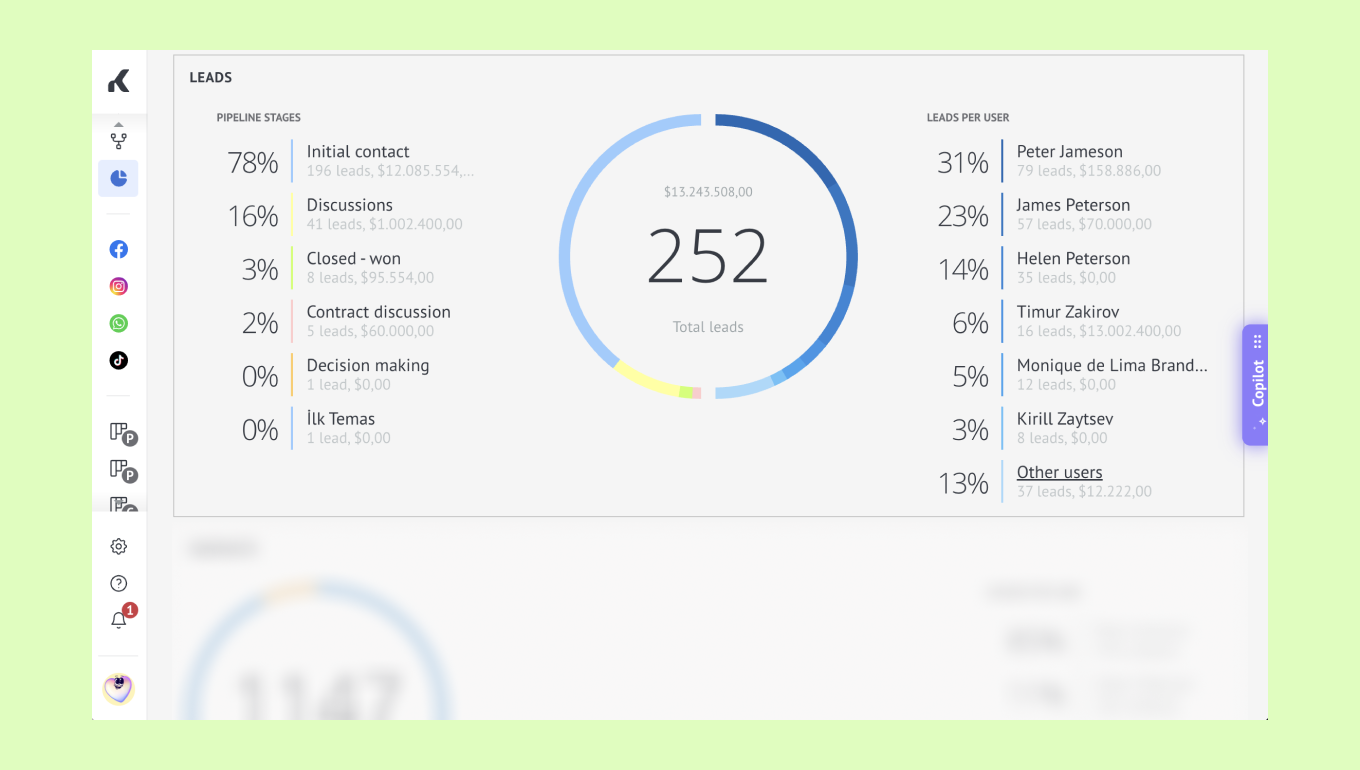
Tip: If there are more stages or users than can be displayed, click Show all to view the complete list.
Contacts
The Contacts widget shows the total number of contact and company records in Kommo, split by record type.
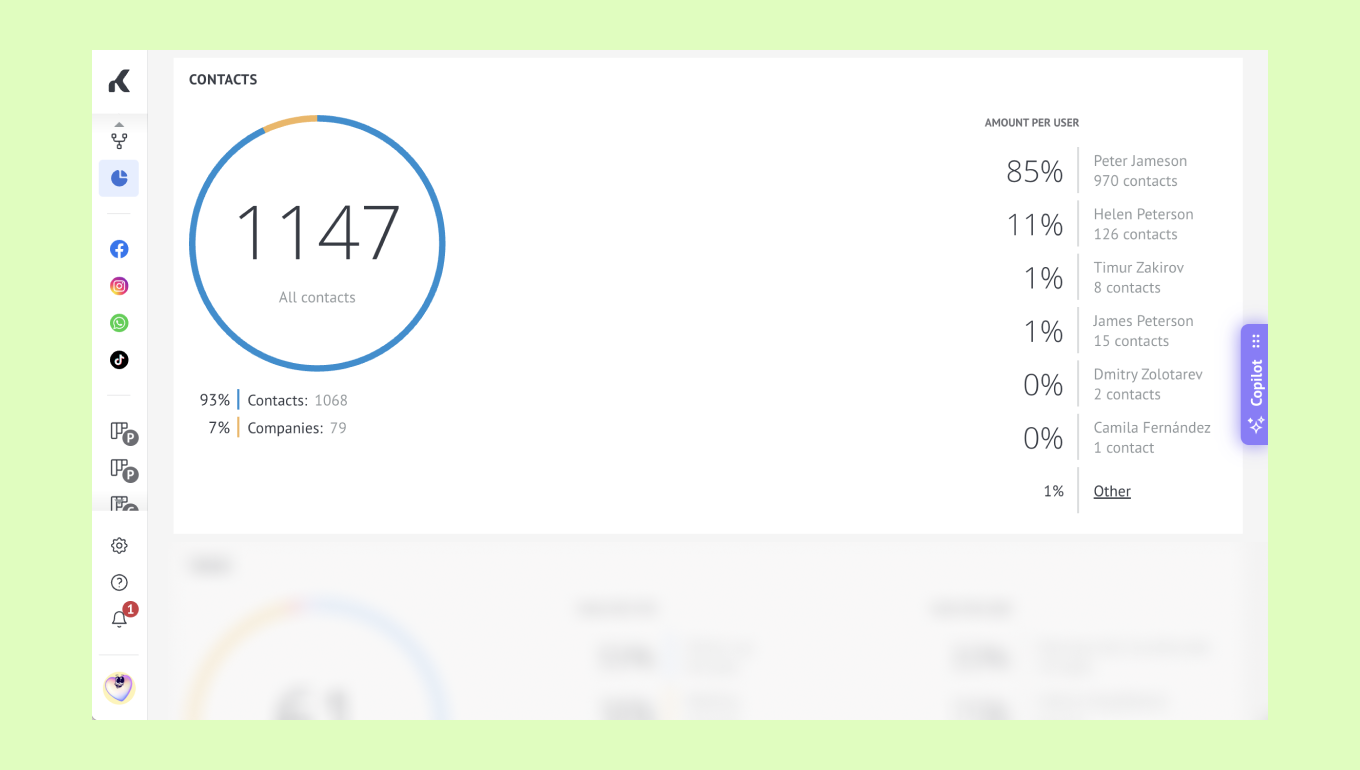
The widget also displays how contacts are distributed among Kommo users, showing the percentage and number of contacts assigned to each user. If additional users are available, they are grouped under Other.
Use this widget to monitor your contact database and understand how records are distributed across your team.
Tasks
The Tasks widget provides an overview of task distribution across your CRM.
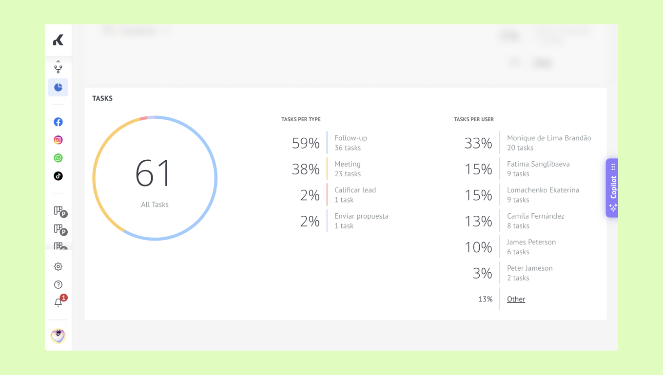
The chart displays the total number of tasks, while the surrounding panels break them down by:
Task type — showing the percentage and number of tasks for each task type.
Kommo user — showing the percentage and number of tasks assigned to each user.
If additional task types or users are available, they are grouped under Other.
Use this widget to monitor task distribution, identify the most common task types, and understand how workload is distributed across your team.